Black and White with Split-Toning - A real priority?

I have focused on capturing the beauty of Lake Champlain for the last five years. My intent is an exhibit, book and making large prints of what I view as eye-holding. The more I shoot the Lake and view the images the more I seem to learn about what I really like. I surprise myself often; I capture an image that I like at the moment, but it doesn't hold my attention long on the wall. On the other hand, I have images that I didn't like as well initially that took me a while of viewing to conclude...this is something that really holds my attention. This is not unlike refining any priority, it takes some experimenting and reflection to know what you really like.

I am not sure about these split-toned black and whites that I recently captured; they haven't had the test of time. But, I am presently attracted to black and white, and in some cases, like the ones that I exhibit here, a little split-toning to warm them up and give me a feel that may just be eye-holding.

Choosing my favorite images for 2011, '12, '13 and '14

2011 There are no images in 2011 that qualify for printing large, to 30x40 or thereabouts, a present objective. That makes sense; I wasn’t geared up to produce images of that size nor did I have that lofty objective back then. Producing large prints became possible for me in 2012 with the purchase of sufficient megapixels with my medium format PhaseOne camera, and with starting to stitch 35m photos from my Canon with Photoshop.

Castellina

Castellina

View all Best of 2011 Photos

It was a fun year to photograph though. It was the year I captured one of my all time favorite photographs — the white villa at Castellina, Italy, in the Tuscany region. Accordingly, my choice for 2011, for my favorite image of the year is easy — it is the White Villa.

The image is really by luck. Well, maybe they all are. I had taken an image of the Castellina village at sunrise, April 5th, with a 300mm lens and a 2x adapter, to affect a 600mm lens. I was high and far away, maybe ten miles, so I still captured too much in the image. The While Villa section of the image is just a fraction of the total image. When I saw the results of cropping to such a small size I was delighted with the results – It presented me with a very painterly effect; one that goes away if I print the image any bigger than about 15x15.

2011 was the year of the Flood on Lake Champlain. The water got to about 103 feet, an all time record level. The breakwater disappeared under water and presented a once in a lifetime view of a May Burlington waterfront with no breakwater and no boats. One morning the sky and water blended together, broken only by the lighthouse and a floating log here and there. I love those images – two are presented in my 2011 picks.

I generally don’t move the camera intentionally while taking a picture. I usually use a sturdy tripod and a cable release to minimize movement while the image is captured. You spend a lot of money to get sharp focus and high resolution – then you’re going to intentionally move the camera and screw it all up? Yes, I do occasionally, to get a feeling. The beauty with digital is you can try it and immediately see what you got and modify accordingly. I continue to enjoy playing with natural elements and motion, looking for that gift of just the right confluence of elements to give me a great feeling to view. Two motion images in 2011 that I like are Summer Dream and Morning Run.

2012  Of the six favorites that I picked for 2012 only Peggy’s Lighthouse and Drought Watercolor are clearly able to produce large both horizontal and vertical directions. Three were taken with my 35mm and stitched to be able to print larger and three were taken with the larger megapixel PhaseOne camera.

Unbelievably, 2012 was a drought year on Lake Champlain, following the flood year of 2011. The drought too presented images I will possibly never again see the likes of. Drought Watercolor and Drought Art are a couple I like, depicting drought effects.

Fish House Blue Rocks

Fish House Blue Rocks

View all Best of 2012 Photos

Patty's and my trip to Nova Scotia in 2012 was special; maybe Patty’s favorite place she’s visited. We went to Peggy’s Lighthouse, the afternoon of September 18th, probably an hour and one half from the village of Lunenburg, where we were staying. I had to get there at sunrise. I got up in the middle of the night on the 19th and drove again to the lighthouse to get there at sunrise. I took my image and got back to Lunenburg for a 9am breakfast with Patty at one of the small friendly village cafes that was getting ready to close for the year.

My favorite image of 2012 was taken at sunrise, another morning while in Lunenburg, Nova Scotia, just a few miles away in the fishing community of Blue Rocks. It is the Fish House Blue Rocks. It has a good feel and look to me. I took the image with the 35mm and stitched 3 images together and I took the image with the 80 megapixel PhaseOne. This was done over a half hour's time. I ended up picking the stitched image because I liked the position of the light on the fish house. The changing light makes all the difference in the world.

Sun Drenched is an interesting light image. It was taken in February of 2012 on Lake Champlain. This Adirondack mountain range is my favorite and I have not yet captured all the beauty I feel from the range. There is always next year.

2013  More prolific in 2013. I suspect because I retired in 2013 and started to become comfortable with the PhaseOne. Accordingly, I show twelve images from which to pick the image of the year, rather than six. I have strong feelings about a number of these images and worry about overdoing the layout for you. I really only wanted to show six, but I couldn’t do it, maybe next year. The more I shoot the more critical I become of my image making, but apparently I am not critical enough yet. I will have to push the learning curve to demand more; to, in effect, raise the bar. I am confident that the more I shoot, the better the images will be and the more discriminating I will become. I will better understand how to narrow the field of possibilities to appealing images. Self study, reviewing others work, and a workshop here and there will also be good to take it to the next level, which I really want to do.

When I enter a photo contest and don’t win I am surprised. I am emotionally locked into my images. I usually look at a number of the winners and say, I wouldn’t have even considered entering that image, or that image, or this other one. I never want to be driven by what others think but jury photography always has something to teach, so I will entire a contest once in a while when I think the theme applies.

red sail yellow marker

red sail yellow marker

View all Best of 2013 Photos

My favorite image of 2013 is one that I have a hard time taking my eyes from and, I know would not have a chance in any photo contest. It is a simple image that took me a half-year looking at before I understood what was so attractive to me. It is the clouds, not the water or boats. The image is Red Sail Yellow Marker. It meets my objective of printable large and, for me, has wall staying power. I sold one the other day, so I guess I am not the only one that likes this image.

2013, and for that matter, 2014 were years of the clouds, or maybe I am just coming a live with the beautiful impact of clouds. I also noticed this in New Mexico when I visited there a number of years ago. Some areas may just have more noticeable dramatic cloud formations.

2014  I found it easier to limit my selection to twelve for 2014. I must be getting more discriminating. I discovered black and white and split toning in 2014. Or rather, I started to fall in love with the more traditional classic look on some images. I started to look at color images as black and white and frequently preferred the black and white, specifically with a warming touch, with split toning. I like the dynamic tonal range I see with black and white. I am getting back to the thinking I had while shooting large-format film with my 4x5 Wiesner; print black and white unless color is an important element for image impact. Seven of the twelve images I show for 2014 are black and white. There is no intent to select the black and whites. It just worked out that way in my unsophisticated selection process.

I had a hard time choosing between Uncertain Weather and Off Track for my 2014 selection. I really love the foreground water in Off Track. I finally chose Uncertain Weather because I love the massive varied clouds dwarfing the mountains and sailboats.

Uncertain Weather

Uncertain Weather

View all Best of 2014 Photos

I realize real artists don’t explain their work and don’t call out their favorites. I suspect that is telling about where I am on the learning curve. The process is good though, for forcing me to select and thus refine my thinking on the value of my images. I have learned how I have moved or changed, by doing this process. Any input you have is welcome. I appreciate all perspectives, unless you try to encourage me to quit this treat of an avocation. I look forward to digging into my images for 2015. As part of my blogging I will review like I have here on a quarterly basis in the process of refining the annual selection. No promises though… I am feeling my way along.

Submission to Light and Landscape magazine for possible publication: A Clear Focus

It was about the time I sold my financial planning practice, at the age of 62, when it became clear to me that a focus on one's priorities was the most important part of financial planning for people; or for that matter, the most important part of planning life itself, and all we desire. I mean a clear focus and not just a casual walk by. I was so stunned by this revelation I wrote a book talking about the importance of values-based priorities planning and how to do it, using my self-proclaimed principles.

A lot of my thinking had evolved over the more than forty years planning with individual clients. I felt compelled though, to be clear with former clients and associates before I closed my professional planning chapter. They deserved it. It is like it hit me.....Hey....wait a minute, I shouldn't go away yet. I have some new stuff; I don't see planners using these principles and processes and they are so important.

It is probably not in the cards for me to have much influence on future planners of the world. I have to let that go. Someone else will undoubtedly figure it out and evolve the same principles for the profession. In fact it will even come out a bit sideways with former clients and associates that read my book, without the benefit of me evolving the practice from theory. Maybe that is the reason I intend to continue connections with former clients and associates, as well as making new connections, professing people's passion pursuits including my own photography passion to capture the image of a lifetime, that when printed large and on a wall will hold the attention of all who look at it.

Now, that I use my priorities planning process for myself with my fifty year personal advocate, Patty, and my professional advocate planner, Cathy, I feel the process is working most effectively - helping me optimize my self-realizing, connecting and giving, to my enrichment. I am retired from professional planning, but not retired from life. In fact, moving into what I call "The Third Period" is most exciting, especially as it relates to photography possibilities.

Being a photo enthusiast for forty years with a desire to better master the craft with my new found time, partially explains my use of photography as an analogy in my book on values-based financial planning, which I titled ADVOCATE PLANNING: To Do What You Love To Do. Another reason is that photography is my passion and I use myself as the main example in the book to explain principles and processes. A third reason is that a number of photography principles apply so well to priorities planning. For instance, terms like focus, center of interest, clarity, simplicity, directional vectors, emotional impact intent, conflicting elements, balance, etc. Feel free to download a free copy of the book right here on this website — just click on "book" in the navigation and look for the download link at the bottom of the page.


LAKE CHAMPLAIN PHOTO PASSION PROJECT

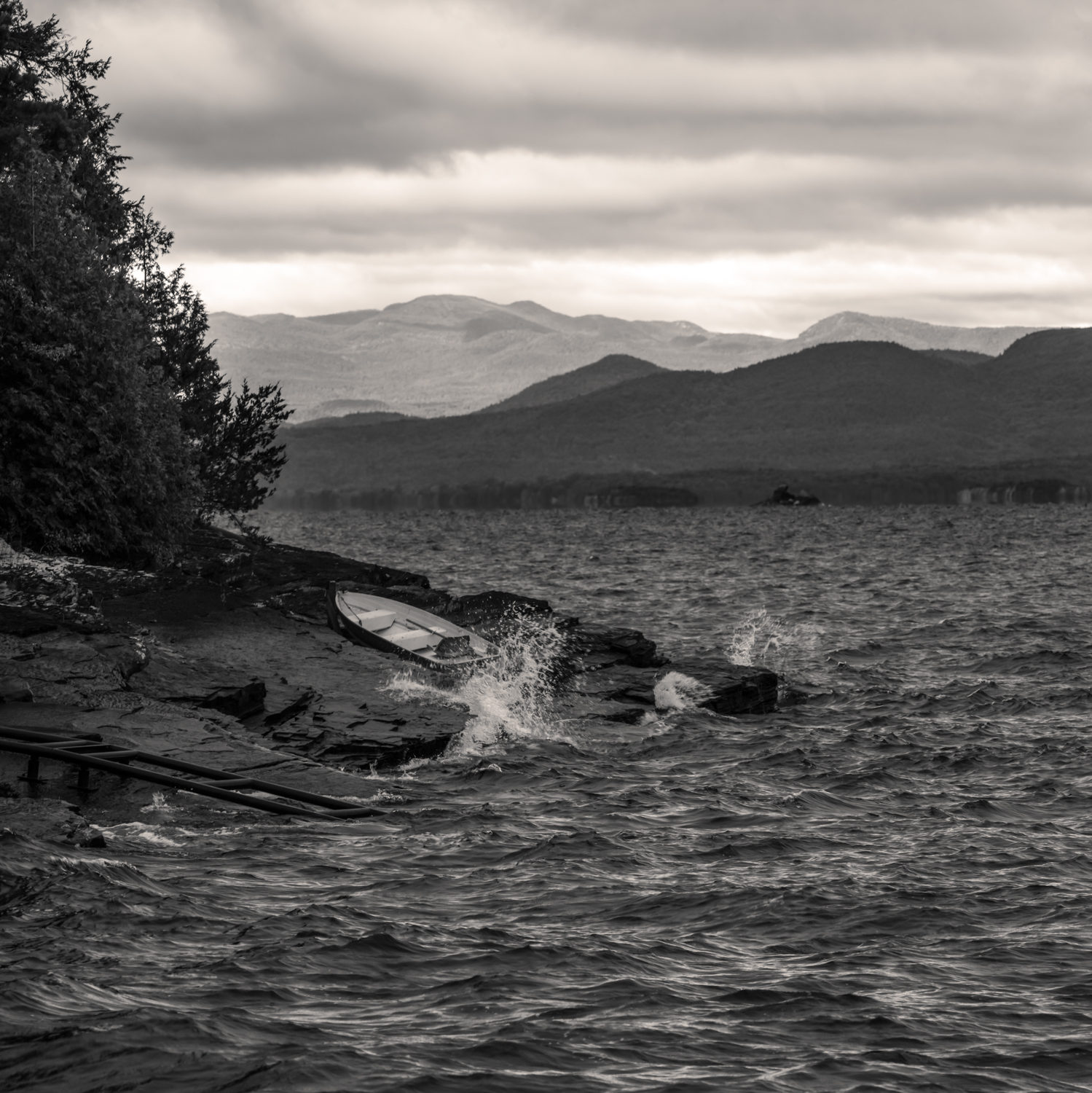
I fell into the Lake Champlain photo passion project, as I call it, because my wife, Patty and I fell in love with the lake, and Burlington, Vermont, the Champlain Valley, and the surrounding Adirondack and Green mountains, while following our professional photographer son Michael's move to Vermont from Minnesota and granddaughter Avi's birth, more than thirteen years ago. Now it is our primary home and my New England base to capture images involving water, my clear photography subject focus.

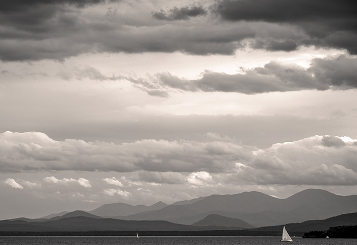
We look across the lake, from our condo, at one of the most beautiful mountain ranges off a lake site in the world. We live on top, what is called, the Burlington Hill-Area, stretching from the waterfront through the popular Church Street downtown to the top of the hill, where you'll find the University of Vermont (UVM) and UVM Medical Center. You can arrange a spectacular view from many points on The Hill during all four seasons. What I find most interesting is, being on a hill and looking straight forward, you most frequently are looking out at the sky above the Adirondack mountains and Lake Champlain. You notice light changes and cloud formations, particularly at dawn, dusk and stormy weather. Often, I have seen something cool coming from the west, grabbed my gear and ran to one of my favorite vantage points to capture yet another look over the same terrain. It is a never ending story of beauty over historic Lake Champlain.

I have well over 10,000 images in Lightroom categorized under "Lake Champlain" and many have common content yet are completely unique captured moments with a unique feel.

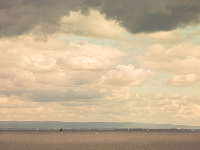
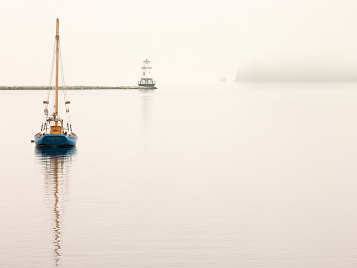
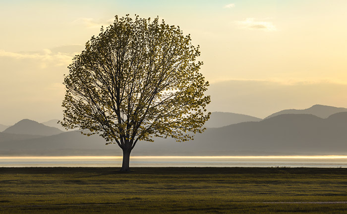
There is a great canvas in my backyard to paint with light. It is never blank. The possibilities to interpret, isolate and catch fleeting light on a subject of interest at just the right time are endless, challenging and exhilarating. My main approach is getting out at the right time, with the right equipment and be patient, open with belief that I will see something that says to me "capture this beauty at this moment" so I and others can feel what I am feeling, while viewing the image, large and impactful on a wall.

I know that with attention to my photo priorities I will continue to learn and contribute. I do love it and I will do it. The necessary ingredient here is passion. The best is yet to come. It has only been recently that I decided to focus my photography on water. I also, not too long ago, clarified my target as a 30"x40" high resolution print. This almost throws me back to needing to use my large-format film camera in order to get the quality. My alternative, with much pleasure, is to push to the limits the PhaseOne IQ180 medium format digital camera, with enough pixel capacity to get the job done. This is the way I figure it: 40 inches x 260 dots per inch = 10400 pixels long side and 30x260dpi = 7800 pixels short side. The overall pixel count being 10400x7800 equaling about the 80MP the camera has. I know this is large and costly. Further, that printing software extrapolates pixels and can, in affect res-up images to look better. I also know that the print might look just fine with less than 260 dpi.

Mostly though, I know that my passion to capture that photo of a lifetime that when printed large and on the wall, to keep the attention of all lookers, will have to be perfect. So, to get there I want a clear focus, attention to priorities and a serious hard-fun ethic!